


What is CSS?
CSS is a design language created to make web pages presentable. It was developed by W3C in 1996 mainly to consolidate the formatting of HTML pages. Initially, styling like color, border, fonts, etc had to be repeated on each HTML file which was a long and expensive process.
CSS is not a necessity to run a web page but boy does it help!🤗
Styling types in CSS
Internal Styling
- This Styling is embedded in the HTML page.
- Initialized using
<style></style>tag which is usually added in the head section
- Its main disadvantage is that it slows down the page load time.
External Styling
- CSS styling is usually added to a .css file
- It is the most convenient way of writing CSS
- It reduces the page load time compared to Internal Styling
Inline Styling
- It is used to apply styling to a single HTML element
- It is also initialized using
<style></style>tag inside the HTML element you want to style
CSS Properties
A CSS Property styles an aspect of an HTML element. eg
<div style="border: 1px solid black; font-size: 18px; ">
          Style This
</div>
The general pattern of a CSS property declaration follows:
    property-name : property-value;

    border: 1px solid black;
The CSS Rule
- A CSS Rule is a grouping of one or more CSS properties that are applied to one or more target HTML elements.
- It consists of a selector and a set of CSS properties.
Here is a CSS rule example:
  div {
      border    : 1px solid black;
      font-size : 18px;
  }
This example creates a CSS rule that targets all div elements and set the CSS properties border and font size for the targeted elements.
- The CSS selector part of a CSS rule is the part before the first {. In the example above it is the div part of the CSS rule. The CSS properties are listed inside the { ... } block.
- The selector determines what HTML elements to target with the CSS rule.
- The CSS properties specify what to style of the targeted HTML elements
- The CSS rule has to be specified inside a style element or inside an external .css file.
CSS Units
CSS Unit is used when creating a site layout it defines how your design will interact on various devices It's divided into these categories:
- Absolute Units
- Font Relative Units
- Viewport Relative Units
- Percentage Unit
Absolute Units
These units are not affected by any screen size or fonts. Mostly used in box-sizing. The display may vary depending on different screen resolutions, as they depend on DPI (dots per inch) of screens.
They include:
- cm (centimeters)
- mm (millimeters )
- in (inches)
- px (pixels)
- pc (picas)
- pt (points)
Font Relative Units
These units depend on the font size or font family of the document or its parent-level elements. This includes units like:
- em
- rem
- ex
- ch
Viewport Relative Units
These units depend on the viewport height and width size and are used to make sites responsive They are:
- vh (viewport height)
- vw (viewport width)
- vmin (viewport minimum)
- vmax (viewport maximum)
Percentage Unit
It can be categorized as a relative unit as it is relative to its parent element and is used to create a responsive layout. Frameworks like Bootstrap, foundation and Bulma use percentage for their base layout.
Percentage is primarily associated with height and width of an element but can be used anywhere where CSS length units are allowed.
CSS Color
CSS has different data types and color is one of them and it use other types such as numbers for its definition such as numbers.
The most used color in CSS is white then black and red
The three types are:
- HEX
- RGB
- HSL
Hex Color
Hexadecimal notation (often shortened to hex) is a shorthand syntax for RGB, which assigns a numeric value to red green, and blue, which are the three primary colors.
According to the Web Almac, Hex is the most popular color syntax type
  h1 {
        color: #b71540;
  }
Ranges from 0-9 A-F used in a 6-digit sequence This then translates to the RGB numeric sequence of 0-255 which correspond to the red, green, and blue color channels respectively.
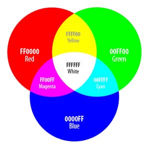
RGB (Red, Green, Blue)
RGB colors are defined with thergb() color function, using either numbers or percentages as parameters.
The numbers need to be within the 0-255 range and the percentages are between 0% and 100%. RGB works on the 0-255 scale, so 255 would be equivalent to 100%, and 0 to 0%.
To set black in RGB, define it as
rgb(0 0 0)
which is zero red, zero green, and zero blue.
Black can also be defined as
rgb(0%, 0%, 0%)
White is the exact opposite:
rgb(255, 255, 255)
or
rgb(100%, 100%, 100%)
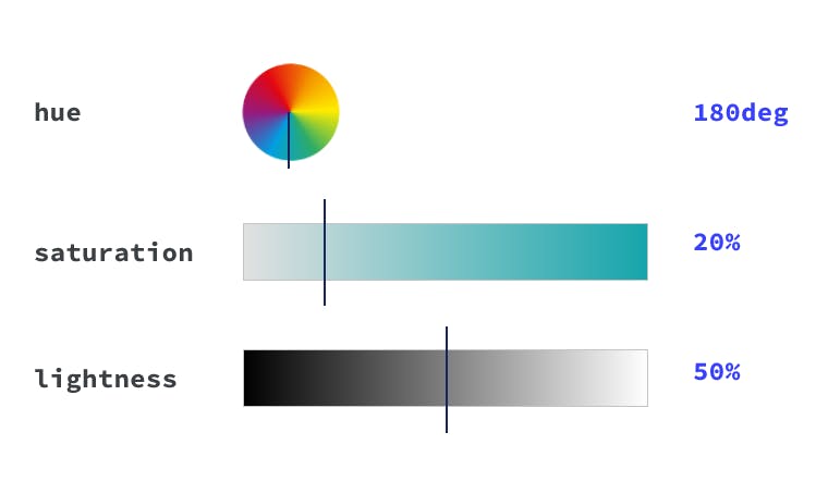
HSL
It stands for Hue, Saturation, and Lightness. It describes the value on the color wheel, from 0 to 360 degrees, starting with red (being both 0 and 360).
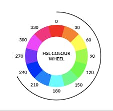
A hue of 180, or 50% would be in the blue range. It's the origin of the color that we see.
Saturation is how vibrant the selected hue is.
Lightness is the parameter that describes the scale from white to black of added light. A lightness of 100% will always give you white.
Using thehsl() color function, you define a true black by writing
hsl(0 0% 0%)
or even
hsl(0deg 0% 0%)
This is because the hue parameter defines the degree on the color wheel, which if you use the number type, is 0-360. You can also use the angle type, which is (0deg) or (0turn). Both saturation and lightness are defined with percentages.
Linking CSS to HTML
You can link your CSS file by using the link tag with the appropriate attributes in the head section
<link rel="stylesheet" type="text/css" href="index.css" />
Conclusion
One of the best ways to become good at something is by practicing: try out your new CSS skills by building a website of your own.